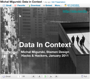
Stamen’s Michal Migurski shares three principles for interactive at NYC Meetup
Suggest editsMuch to the enjoyment of the map junkies of the group, Hacks/Hackers NYC welcomed Michal Migurski, partner and resident cartography guru of interactive agency Stamen Design, to the Jan. 11 meetup. He showcased two of his “civic-oriented” projects, Oakland Crimespotting and This Tract, each aiming to make government data interactive and accessible for the public good.

Migurski introduced his company and shared some of Stamen’s past work, including Digg Swarm, which represented online buzz following the reported death of Saddam Hussein.
Migurski also shared MSNBC Historical Hurricane Map, a highly interactive program that plots more than 150 years’ worth of data from 1,410 hurricanes.
For SFMOMA Artscape, Stamen visualized over 3,500 artistic works on a sliding navigational backdrop for the San Francisco Museum of Modern Art. Here, users can discover works by clicking on artist names, individual artwork, and a variety of other variables.
Next, Migurski discussed three contexts he regularly keeps in mind when constructing his interactive pieces.
The first, “Here vs. There,” refers to the geographical nature of his work. Data is typically anchored by a physical landscape, or more simply, plotted on a map. Drawing in data from specific geographic locations sometimes more effectively tells a story about the collective whole, Migurski believes.
The second context, “Now vs. Then,” indicates a timeline exists in the work, or an analysis of trending over time. In the case of the MSNBC Hurricane Map, users could toggle between more than 150 years of hurricane data, and visualize trends during this time frame.
“Small-Here vs. Big-Here” is his third guiding principle, and emphasizes the importance of giving users customizable tidbits of personalized information (i.e. stats about a particular user’s hometown) and comparing that data to a national, or macro, level. Migurski referenced The Long Now Foundation as an example of a project that touches on all three of these concepts: big here, long now, and existing for a long period of time.
Moving on to his next project, Oakland Crimespotting, which was inspired by a Crime Watch, the Oakland Police Department’s slightly archaic crime mapping website. The Crime Watch website’s usability was low; with pixelated graphics, strange icons and above all, forcing the user to answer a series of questions about which data he/she would like to plot before revealing the map visualization.
Migurski’s group revamped the site. Knowing they could rely on faster browser speeds, they designed an interface that gives the user an overview of available data and allows them to drill down as necessary. Because Migurski says he believes it’s “important for every crime to have local context,” each incident has its own linkable and easily referenced Web page.
He says he hopes this interactive database will foster more informed awareness and meaningful discussion in Oakland – part of how he believes programmers like him can repurpose data for the public good. And by automatically incorporating data directly from the Oakland PD, Stamen can maintain the Crimespotting map with relatively little upkeep.
Next, Migurski showed off another of Stamen’s projects, This Tract, which he described as a “weekend hack that turned into something larger.” Using census data, the program gives detailed stats about each tract by ethnic makeup, education, age, income and more, and compares each tract to various scales, such as county, state and national data.
Before delving into the details of This Tract, he mentioned a few other data visualizations from other individuals who have created maps with the same census data. The New York Times project, Mapping America: Every City, Every Block, mapped such variables as ethnic makeup and change in median monthly rent over the past decade.
Eric Fisher produced a visually stunning Flickr set of maps, visualizing ethnic makeup in several cities. “Radical Cartographer” Bill Rankin created a similar map of Chicago, where racial divisions are prominent. Lastly, Migurski admired promotional advertising for the 2010 census, noting they promise the return of public good in exchange for participation in the census.
Turning the focus back to his project, he called out particular tract data, illustrating the racial makeup of New York’s Chinatown, the educational level of those living around Harvard, as well as how many senior citizens live in Collier County, Fla.
This Tract signifies Migurski’s growing interest in using government/census data to give a broader, national perspective than what was possible with Crimespotting. Because census spreadsheets can be very large, sometimes with hundreds of columns of data, Migurski had to write a Python script he calls census-tools. He also used Protovis to allow some interactive appeal, like tool tips, and the FCC census block conversions API.
He concluded his presentation with a reminder of his three guiding contexts: Here vs. There, Now vs. Then and Small-Here vs. Big-Here.
**

Kennedy Elliott is a visual storyteller based in New York, NY, and a newbie to Hacks/Hackers NYC. You can tweet her_ @kennelliott_.